
There is nothing more definitive in design, any design discipline for that matter, than colour choice.
Fabric, texture and finishes enhance and characterise a room, but the difference between using a bright yellow armchair vs a cool white is monumental.
So where in the colour spectrum do you sit?
As time rolls by, we naturally acquire new 'things', new loves, new style, and a streamlined colour choice is rarely part of the long term equation.
Styling affords us the luxury of experimenting on a daily basis, examining combinations, adoring a look one minute and banishing the idea the next.
It is true that a restricted colour palette is easy to work with and establishes a solid visual story with seemingly, minimal effort.
Of course, this is far from the truth. Depending on their intended location, honing in on the precise colours that make us feel calm, energised or relaxed is more often than not a deeply involved process.
Here we highlight inspiring examples of colour at work- and play!- so you can confidently place a firm foot in your preferred camp.

Ménage a trois
literally translates to mean "three in a house", so here we highlight three houses with three differing pink colour schemes that tell vastly contrasting stories.
Playful in every way, the room above oozes vibrancy. Crimson red energises lipstick worthy tones.
Muted, soft and understated is where this traditonal formal lounge finds a modern edge. Styling by Cooper Robinson. Photography by Northside Studio.
Touches of soft peach offer this Melbourne Mid-Century masterpiece a stroke of glorious femininity while not dominating the incredibly sophisticated home. Styling by Cooper Robinson. Photography by Northside Studio.

Shining a light
on a single hue in a room that would otherwise border on monochromatic is bold and considered.
Here we’ve shone that light on the idea of autumnal colour, your eye is immediately drawn to this earthy pop. Styling by Cooper Robinson. Photography by Northside Studio.

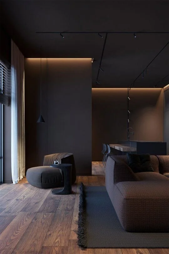
Muted tones
new ideas and old methods make a washed emerald ceiling the star of this enviable show.
The Greyscale is still as popular as ever. The skill lies in layering warm and cool tones with enough contrast and texture to create interest. Styling by Cooper Robinson.
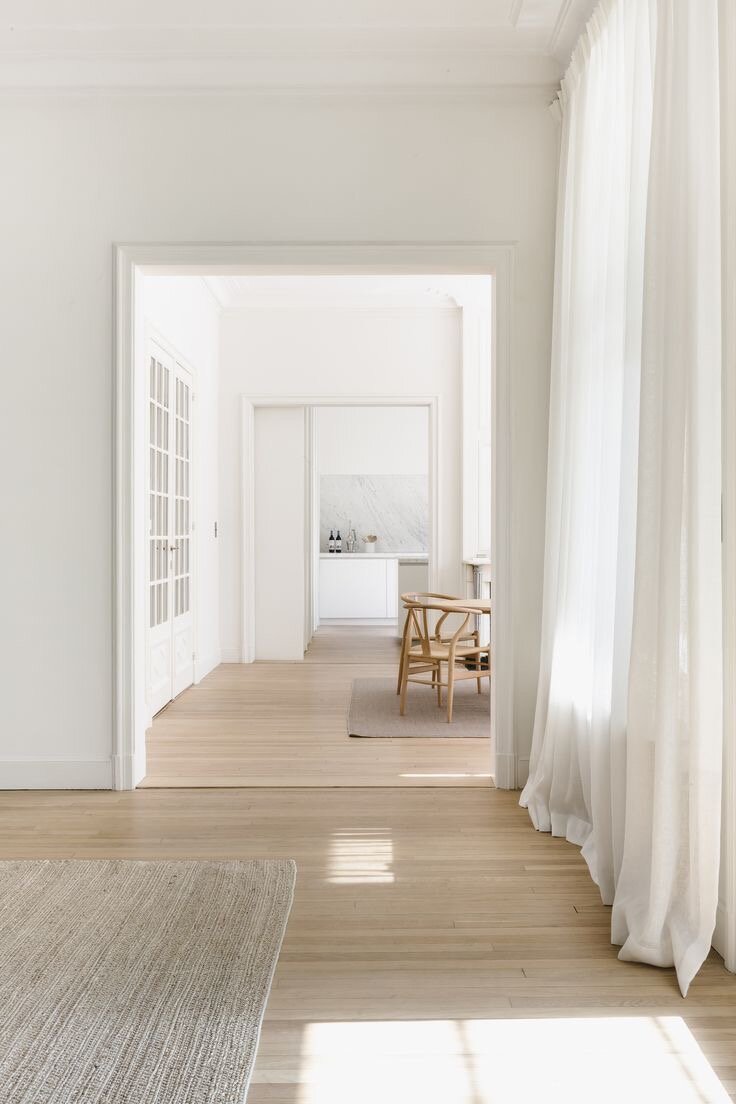
“But perhaps the absence of colour is the boldest statement of all?
”